Coming to a Kickstarter page near you, a new helpful aid for your 5e games by the folks at Cardamajigs – “The Deck of Many“. Being that you, dear reader, are most likely a 5e GM (or player) maybe we should sit down for a moment and talk bout this potential new resource for your gaming needs. Cardamajigs were kind enough to send over some samples my way to check out so I could review them and help spread the word. So, are they going to be your next gaming accessory? Let’s jump in and find out!
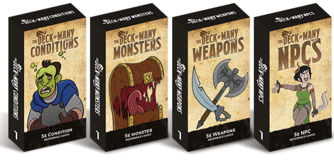
4 Decks To Choose From
While their Kickstarter video here is hilarious and I may outright back these based on the premise of a D&D infomercial alone, there’s a lot of competition in this space right now. Hopefully through this brief overview I can help you determine whether the Deck of Many worth your hard earned coin. Game aides for D&D have always been plentiful, but since 5e is relatively new there’s a constant barrage of new and awesome things coming at us and The Deck of Many is no exception. Some of the things I really like about the cards are that they’re a great quality (330 GSM to be precise), water resistant and UV coated and tarot-sized.
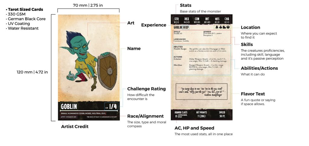
The tarot size can go either way for some, on one hand it’s nice to have the bigger card for the visuals, but it may be overkill for others. It seems the tarot size may have been chosen just to fit all of the necessary text onto some of the cards, as a few of the monster cards I’ve seen have what appears to be 6 or 7 pt font just to cram all the info onto the card. The Tarrasque requires 2 full cards front and back to fully encapsulate it’s host of abilities, but I won’t blame font size there, because the Tarrasque is simply one of D&D’s most absurd bad guys.
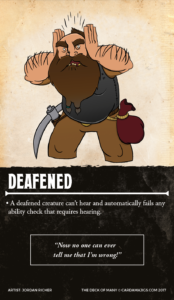 Condition Cards
There are numerous ways to track conditions these days, I previously reviewed the Crit Games version, and found them to be very useful in my games. These follow along those same lines, however the art style is different and the cards are much larger. I could definitely see wanting to pick these up because of their increased size and the dash of humor / flavor added in.
Weapon Cards
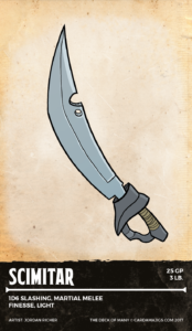
Unfortunately I find the weapon cards the least useful of the bunch. Aside from showcasing the art or using them as reminders for younger players, there is very little info on the cards. That isn’t necessarily a design fault of the cards themselves, as much as it is simply that weapons in D&D only require a single line of text to fully describe their attributes. Perhaps elaborating what properties like “finesse” or “light” constitute mechanically could have made these feel more useful.
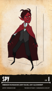 NPC Cards
The NPC cards are probably my favorite offering here, as I find that sometimes it’s possible for the GM, players, or both to forget about backgrounded NPCs traveling with the party. These cards provide a quick at-a-glance reference without having to flip to the back of a book or jot down stat blocks somewhere. There are of course other great uses for the NPC cards, but that one’s just my favorite example. The visual aide is also a nice reminder for everyone at the table, I feel like this is a great example of where the Tarot sized cards really shine.
Monster Cards
The Monster cards info on the back is well done and easily referenced, and even shows the types of environments they dwell in via a series of icons shown underneath their stats. With the exception of the more complex monsters like the Tarrasque, all monsters fit onto a single card. Unfortunately, in order to pull that off some of the text on the monster cards is very small (6 or 7 pt font). The range in art styles spans from something akin to Adventure Time, to full on digitally painted art done by well-known artists such as Jason Engles. While Engles’ art is gorgeous, it gives off a very different aesthetic than the rest of the cards.
 Wrap Up
Overall, I feel these are a great product for 5e players and GM’s alike, depending on a groups needs. The artwork is going to be a bit divisive for some though, and I feel the mixture of art styles takes away from an otherwise cohesive feel of the product. I’d say that from a visual design standpoint some of the space could have been better utilized in some places, and the quirky quotes could have been forgone for a larger font size, to increase usability at the table. However, despite these niggling little critiques, I’m pretty excited to see where this one goes. What do you think? Are you going to be backing this one? Let me know in the comments below!

I bought better monster ones at Gencon, which also seem to be on DriveThruRPG: 5e Creature Decks. They’re cheaper, have many more cards per deck, and the art style is better–almost all a painted look instead of colored line art, that often goes for comedy. The only advantage to these is the larger size could allow for bigger text, but the layout choices don’t really take advantage of that as you wrote. Those are standard card size so they easily fit in most card storage products.